So, now that America, collectively and individually, has piled up debt to unsustainable levels, where do we go? Better answers might be found elsewhere, but here's my take nonetheless:
We need to admit we're poor.
Not Bangladesh-style desperately poor, but at the very least a good bit poorer than we were in, say... 2000. Okay, bad year to pick. How about 1997? That's before the dot.com boom really took off, and the year housing prices started to ramp up - both of which were in part caused by the passage of a package of capital gains taxes that year. Or maybe 2004 - stocks were at a reasonable level and housing prices weren't melting up yet? And there is the possibility that I am completely wrong.
So how can we figure out how rich or poor we are? One way would be to construct an economy-wide balance sheet and compute the net of assets and liabilities. There is a big problem with that approach - a lot of assets are mis-priced at this time. Real estate, stocks, bonds, autos, plant, equipment - who knows what they are worth, or will be. Between housing and stocks, about $14 billion in assets have gone up in smoke over the past year or so. But we'll look at the results of that approach anyway. The other way to is look at economy-wide cashflows to see how much is obligated and how much can be freely spent or saved. This approach has problems also, in that a lot of debts are about to be defaulted on, which will alter cashflow significantly. But money will still change hands for all kinds of reasons, so it might be a better approach.
Fortunately, the gnomes at the Fed (just kidding - they are perfectly fine people aside from Greenspan) have done a lot of the hard work already. The quarterly Flow of Funds report captures all kinds of interesting data. Well, interesting if you are interested in uninteresting kinds of things.
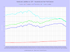
 This graph of the household and non-profit sectors doesn't look so bad at first glance (unfortunately the two sectors are lumped together in the report). Liabilities are up, assets are up more, and thus net worth is up. The only worrying aspect is that the ratio of assets to liabilities has declined substantially.
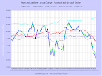
 This graph shows several interesting - but not particularly surprising - things. First, net worth tracks changes in assets closely. Second, both assets and liabilities track changes in GDP, but exhibit greater swings. Third, the mean increase in liabilities is well above that of assets.
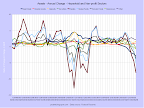
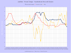
 Zooming in on the past 15 years highlights both the dot.com bubble of 1997-2000 and the housing bubble of 2003-2007.
 Here are the changes for the same time period.
 This graph better highlights the dot.com blowup and the new downturn that is developing - and that will probably keep going for a while. (I'm not sure if this way of presenting the data is good but I'm keeping the graph here for now.)
 This graph shows how first equities then real estate expanded as a proportion of household and non-profit wealth. The other asset classes have remained mostly constant, but should grow in proportion in the next few years as both stocks and real estate are set to decline.
 Here are the annual changes for the same asset classes.
 Assets again, this time verses nominal GDP change. (I'm not sure if this way of presenting the data is good but I'm keeping the graph here for now.)
 Liabilities appear less diverse because several types of borrowing - credit cards, auto loans, and some others - are jammed into the consumer loan category. The other category consists mostly of several types of non-profit liabilities - a few other household liabilities are in there too. Residential mortgages dominate.
 The mortgage debt buildup during the housing bubble is really noticeable here. There was also a smaller buildup of consumer debt back during the dot.com bubble - that might have been either wealth-effect borrowing (borrowing in light of high stock values) or margin borrowing to invest in stocks.
 Here is liability growth compared to GDP growth. (I'm not sure if this way of presenting the data is good but I'm keeping the graph here for now.)
So after looking at all those squiggly lines, what have we learned? First, both assets and net worth are currently significantly higher than their long-term averages. We know the dot.com uptick was illusory, and there is every reason to think the same about the housing bubble. In fact, the drop-off can be seen already. Second, despite the upturns in assets and net worth, the ratio of assets to liabilities has come way down. Now, a lot of the long-term decline was probably due to reasonable expansion of credit for previously under-served minority communities. But the flatline from 2002, when the stock market was at a low point, to 2007, when both the stock market and the housing market turned down, is worrisome. People were adding debt at nearly the same rate as their assets were increasing during an expansion. And growth wasn't even very strong.
No comments:
Post a Comment